AppSuite:Theming
API status: In Development
Abstract. In this article, you can learn how to create customized themes and use them to change the look of you appsuite installation.
LESS.JS
Appsuite used LESS as dynamic stylesheet language. LESS extends CSS with dynamic behavior such as variables, mixins, operations and functions.
Please read LESS.JS documentation first.
Using less.js
If your theme depends on less.js, you will need one more step to make it work. Why? To accelerate the login, compilation of LessCSS files was moved from the login process in the browser to the installation process on the backend.
Backend packages for themes and any apps which ship .less files require the following changes:
1. Add "skipLess=1" to the build command in *.spec and in debian/rules:
sh /opt/open-xchange-appsuite-dev/bin/build-appsuite app skipLess=1
2. Add %post and %postun sections to *.spec:
  %post
  if [ "$1" = 1 ]; then
  UPDATE=/opt/open-xchange/appsuite/share/update-themes.sh
  [ -x $UPDATE ] && $UPDATE
  fi
  %postun
  UPDATE=/opt/open-xchange/appsuite/share/update-themes.sh
  [ -x $UPDATE ] && $UPDATE
For multiple binary packages, the %post and %postun sections should apply only to backend packages which contain .less files.
3. Add debian/postinst and debian/postrm containing the same content:
  #!/bin/sh
  UPDATE=/opt/open-xchange/appsuite/share/update-themes.sh
  [ -x $UPDATE ] && $UPDATE
For multiple binary packages, the postinst and postrm files should apply only to backend packages which contain .less files.
Note: Since 7.2.1, LessCSS files must have the file extension .less to be usable with the 'less' RequireJS plugin (module dependencies of the form 'less!filename.less'). Previously we were more lenient and dealt with .css, too.
File structure
A theme basically consists of two files located in apps/themes/THEME_ID/. These files are described in this and the following sections.
THEME_ID is a unique identifier for your theme, which is not visible to users. By convention, it is best derived from a domain name you control, e.g. com.example.prettytheme.
definitions.less
This file can be used to override variables described in the "Variables" section of this article.
style.less
This file can be used to define any CSS you like. Before doing this, check, if there really is no variable that can be used to achieve the same thing.
= Referencing paths
Since 7.2.1, all URLs are relative to the source .less file in which they are contained. This means that unless a theme changes an image it does not need to include that image anymore.
Old themes must be updated if they change an image from the default theme: All styles from the default theme which refer to a changed image must be overwritten in the custom theme. This way the URLs resolve to the new image.
Variables
Naming of the variables should be straight forward. Variables containing the word Background will always refer to the background color. Variables containing Color will refer to the foreground color of an element, like color of a font. Hover in most cases means "hovered" elements. Selected relates to the currently selected item. Elements that are supposed to catch the users eye can use the Highlight class and the variable contains this word.
Basic
Font
| Variable | Default | Description |
|---|---|---|
| @sansFontFamily | "Helvetica Neue", Helvetica, Arial, sans-serif | |
| @serifFontFamily | Georgia, "Times New Roman", Times, serif | |
| @monoFontFamily | Monaco, Menlo, Consolas, "Courier New", monospace | |
| @baseFontSize | 14px | |
| @baseFontFamily | @sansFontFamily | |
| @baseLineHeight | 20px | |
| @altFontFamily | @serifFontFamily | |
| @touchFontSize | 15px | |
| @headingsFontFamily | inherit | |
| @headingsFontWeight | bold | |
| @fontSizeLarge | @baseFontSize * 1.25 | |
| @fontSizeSmall | @baseFontSize * 0.85 | |
| @fontSizeMini | @baseFontSize * 0.75 | |
| @vgridFontSize | 13px |
Colors
| Variable | Default | Description |
|---|---|---|
| @bodyBackground | @white | |
| @textColor | @grayDark | |
| @linkColor | #08c | |
| @linkColorHover | darken(@linkColor, 15%) | |
| @linkAccentColor | #ffad00 | |
| @linkAccentColorHover | darken(@linkAccentColor, 15%) | |
| @badgeColor | @white | |
| @badgeBackground | #555 | |
| @headingsColor | inherit | |
| @black | #000 | |
| @grayDarker | #222 | |
| @grayDark | #333 | |
| @gray | #555 | |
| @grayLight | #aaa | |
| @grayLighter | #eee | |
| @white | #fff | |
| @blue | darken(#049cdb, 5%) | |
| @blueDark | #0064cd | |
| @blueLight | lighten(#049cdb, 25%) | |
| @green | #1A8D1A | |
| @greenLight | #92D050 | |
| @red | #cc0000 | |
| @yellow | #F8E400 | |
| @orange | #f89406 | |
| @pink | #E01CD9 | |
| @purple | #7E16CF |
Space
| Variable | Default | Description |
|---|---|---|
| @paddingLarge | 11px 19px | |
| @paddingSmall | 2px 10px | |
| @paddingMini | 0 6px | |
| @baseBorderRadius | 4px | |
| @borderRadiusLarge | 6px | |
| @borderRadiusSmall | 3px |
Pagination
Used where pagination is done, for example in the Calendar weekview, each week is on one "page"; one can switch the week using a pagination widget styled with these variables.
| Variable | Default | Description |
|---|---|---|
| @paginationBackground | #fff | |
| @paginationBorder | #ddd | |
| @paginationActiveBackground | #f5f5f5 |
Buttons
| Variable | Default | Description |
|---|---|---|
| @btnBackground | @white | |
| @btnBackgroundHighlight | darken(@white, 10%) | |
| @btnBorder | #bbb | |
| @btnPrimaryBackground | @linkColor | |
| @btnPrimaryBackgroundHighlight | spin(@btnPrimaryBackground, 20%) | |
| @btnInfoBackground | #5bc0de | |
| @btnInfoBackgroundHighlight | #2f96b4 | |
| @btnSuccessBackground | #62c462 | |
| @btnSuccessBackgroundHighlight | #51a351 | |
| @btnWarningBackground | lighten(@orange, 15%) | |
| @btnWarningBackgroundHighlight | @orange | |
| @btnDangerBackground | #ee5f5b | |
| @btnDangerBackgroundHighlight | #bd362f | |
| @btnInverseBackground | #444 | |
| @btnInverseBackgroundHighlight | @grayDarker |
Dropdowns
| Variable | Default | Description |
|---|---|---|
| @dropdownBackground | @white | |
| @dropdownBorder | rgba(0,0,0,.2) | |
| @dropdownDividerTop | #e5e5e5 | |
| @dropdownDividerBottom | @white | |
| @dropdownLinkColor | @grayDark | |
| @dropdownLinkColorHover | @white | |
| @dropdownLinkColorActive | @white | |
| @dropdownLinkBackgroundActive | @linkColor | |
| @dropdownLinkBackgroundHover | @dropdownLinkBackgroundActive |
Foldertree
| Variable | Default | Description |
|---|---|---|
| @foldertreeSidepanelBackground | #333 | |
| @foldertreeSectionTitleColor | #888 | Color for sectiontitles in foldertree (like "Public" folders) |
| @foldertreeActiveLabelColor | #ccc | Active means, user can perform an action on this item |
| @foldertreePassiveLabelColor | #ccc | Passive means, user can not perform any action with this item |
| @foldertreeHoverBackground | #888 | |
| @foldertreeSelectedBackground | #222 | |
| @foldertreeBadgeBackground | @bagdeBackground | see #Colors for definition of @badgeBackground |
| @foldertreeBadgeColor | @badgeColor | see #Colors for definition of @badgeBackground |
Calendar
Appointment
| Variable | Default | Description |
|---|---|---|
| @appointmentReserved | #08c /* blue */ | Appointment status color |
| @appointmentTemporary | #ffbb00 /* yellow */ | Appointment status color |
| @appointmentAbsent | #913f3f /* red */ | Appointment status color |
| @appointmentFree | #8eb360 /* green */ | Appointment status color |
| @appointmentPrivate | #555 /* gray */ | Appointment status color |
| @appointmentDeclinedFont | #888 /* dark gray */ | Font color for declined Appointments |
| @appointmentUnconfirmedAlpha | 0.4 | Transparency value for unconfirmed Appointments |
| @appointmentDeclinedAlpha | 0.3 | Transparency value for declined Appointments |
| @appointmentHoverPct | 15% | Percentage increase of the dark pigment content on hover effect |
Week View
| Variable | Default | Description |
|---|---|---|
| @weekviewAppointmentLasso | #aeaeff | Lasso frame color |
| @weekviewDayIn | #fff /* white */ | Default background color in week view |
| @weekviewDayOut | #e0e0e0 /* grey */ | Background color outside of the mean working time |
| @weekviewTimeline | #f00 /* red */ | Color of the Line indicating the current time |
| @weekviewTimeWith | 58px | With of the time labels on the left side |
| @calendarToolbarHeight | 41px | Height of the control toolbar |
Month View
| Variable | Default | Description |
|---|---|---|
| @monthviewAppointmentOut | #aaa /* light gray */ | Color of appointments, which are not in focus |
| @monthviewToday | #daefff /* light blue */ | Background color of the current day |
| @calendarToolbarHeight | 41px | Height of the control toolbar |
Area names
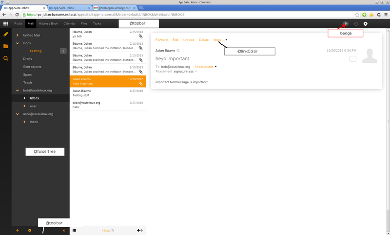
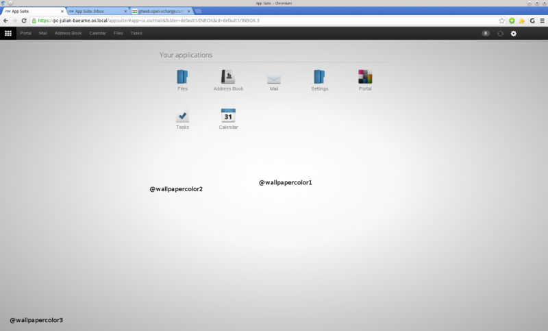
The variables sometimes refer to common areas. To identify which area is located where, see the following annotated screenshots.
Mixins
In LESS, it is possible to include a bunch of properties from one ruleset into another ruleset. So say we have the following class:
Sample
.border-radius(@radius: 0px) {
    -webkit-border-radius: @radius;
    -moz-border-radius: @radius;
    -ms-border-radius: @radius;
    border-radius: @radius;
}

#menu a {
  color: #111;
  .border-radius(5px);
}
Read LESS Mixins
global OX Mixins
they can be found at definitions.less
| Mixin | Sample | Description |
|---|---|---|
| .box-sizing(@boxmodel) | .box-sizing(border-box) | |
| .user-select(@select) | .user-select(none) | |
| .border-radius(@radius) | .border-radius(3px) | |
| .box-shadow(@shadow) | .box-shadow(3px) | |
| .vertical-gradient(@startColor, @endColor) | .vertical-gradient(#888, #555) | |
| .radial-gradient(@color1, @color2, @color3) | .radial-gradient(#111, #222, #333) | |
| .transition(@transition) | .transition(background-color 0.2s linear) | |
| .animation(@animation) | .animation(slidein 300ms) | |
| .animation-name(@name) | .animation-name(slideright) | |
| .ellipsis | .ellipsis | |
| .overflow(@type) | .overflow(hidden) | |
| .overflow-x(@type) | .overflow-x(hidden) | |
| .overflow-y(@type) | .overflow-y(hidden) | |
| .backface-visibility(@type) | .backface-visibility(hidden) |
How to activate a theme during development
When creating a new theme, you don’t have it installed with your frontend. In this case you don’t want to go to a complete build of a theme and reinstall it for every change. The trick is to create your theme and overwrite the default theme with it. You can then use the appserver proxy to ship your own version of the UI.
To activate a theme on the backend, you have to add it to the io.ox/core/settingsOptions//themes list.
Example
Adding
io.ox/core/settingsOptions//themes/unicorn=Friendship is Magic
to etc/settings/appsuite.properties add a theme named unicorn with the name Friendship is Magic to the list of themes, a user can choose. Find the list in the Settings -> Basic view behind the option Theme.
Theming the login page
The login page is a little bit special. If you don’t use the form login (and provide your own login page), you might want to theme the login page, too. Learn how to do this here.
Best practice
To be really safe, it’s best to only define your own values for the variables shown above. If this really breaks anything, we consider this a bug, please report it [1] in our bugzilla.
Of course, using CSS in style.less file to define your own styles is also possible. Make sure to test your style in such cases more carefully. It is most likely safe to change minor things using this file, but if you plan to change any positions of larger elements, this might break the complete design. So please be careful when overwriting the default CSS rules.
Links
Caveats
It is not recommended to change the size of elements or their position. If you really want to do so, please check on all devices and in all browsers and make sure you didn’t break anything. You even have to be careful when changing the font, because this might have effects on positioning, too.
As mentioned before, changing colors should be safe.

